Simplifying Budgeting
Transforming complex navigation and data handling, resulting in 80% workload reduction and 50% budgeting time savings.
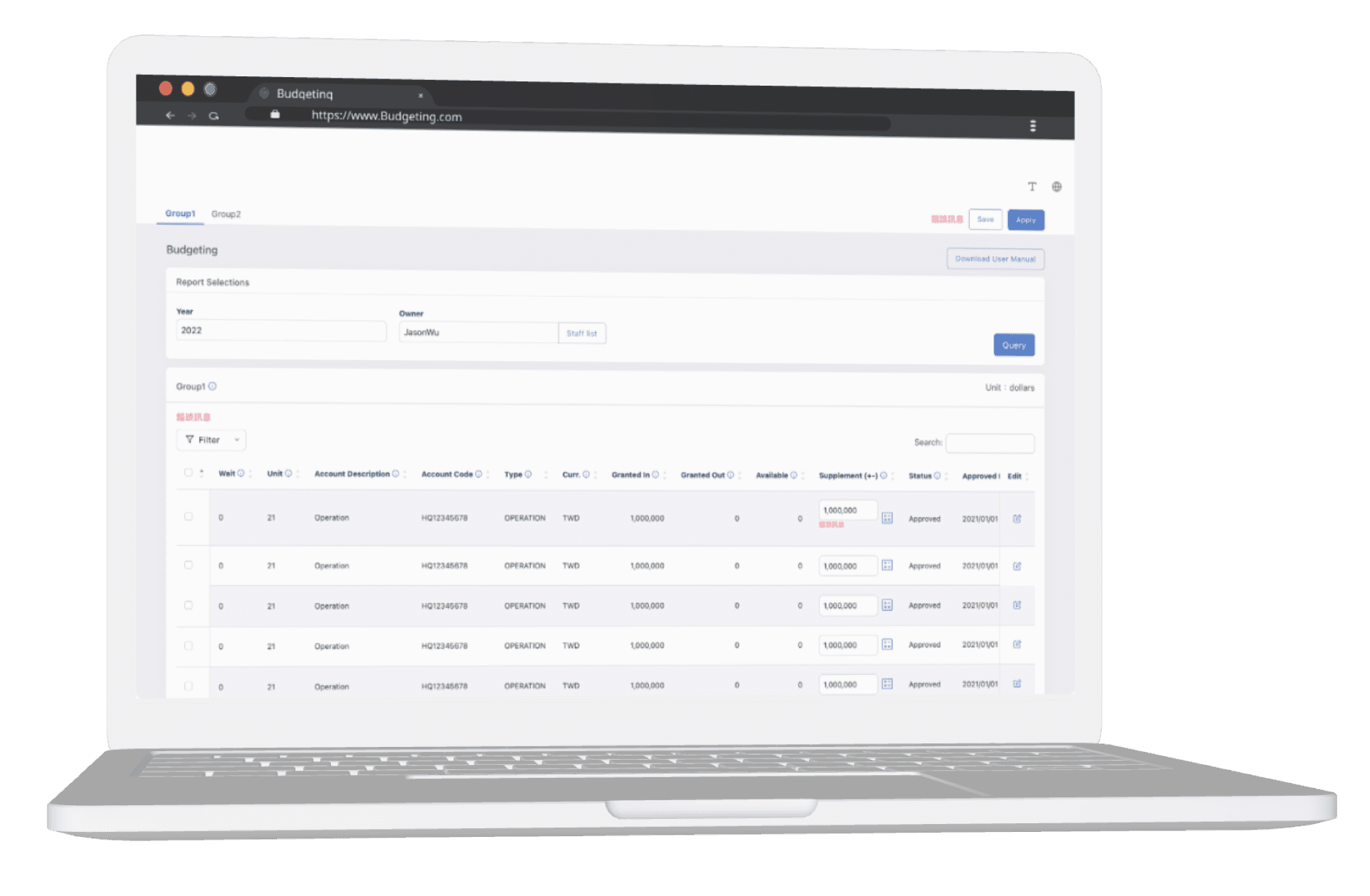
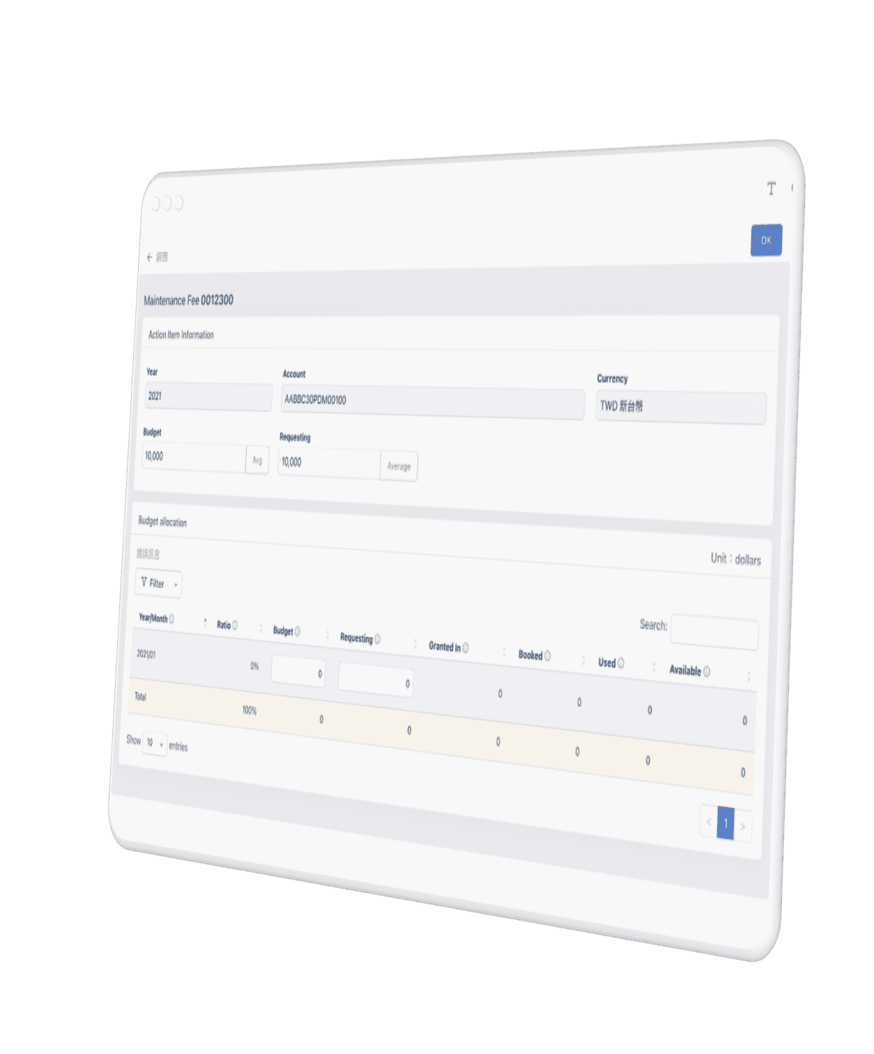
Project Profile
Time
Mar 2023 – Mar 2024
Duration
1 year
Role
Senior UX Designer
Project Brief
I was assigned to redesign a semiconductor's internal Budgeting, which had not seen changes in over a decade. It provides me with an opportunity to leverage and strengthen my design skills in collaboration with the UI designer, developers, and business users.
My Main Contributions
UX research, journey map, ideation, low-fi design
Prototyping and user testing
Stakeholder presentations
Final outcome
80 %
Reduction in workload
50 %
Reduction in budgeting time
The redesign targeted senior executives and business owners, who previously struggled with the Budgeting system's complexity and lack of clarity in the information architecture and functionalities. By reevaluating user scenarios and following usability guidelines, we have reduced the workload for the business owners’ by 80% and decreased the time managers’ spend on budgeting by 50%.

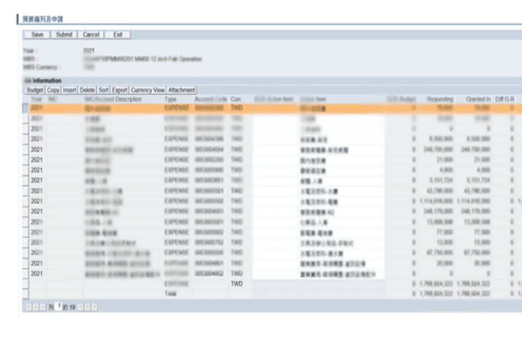
Before (Since 2016)
Complex Navigation and User Interface
Difficult to handle large datasets

After
Clear Hierarchy
Information Icon
Fixed Action Columns

Main challenge
Complex navigation and user interface
Given that the UX team is a relatively new addition to our organization, there is a notable gap in incorporating UX practices into the development lifecycle.
Difficult to handle large datasets in tables
Faced with challenges of lacking technical documentation for understanding the existing 196 system business framework and a small UX team with one novice designer, we needed to interview application owners for business clarity and mentor our designers for effective outcomes.
Inconsistent user behaviour
The budget system's interface is inconsistent with other systems used by executives, makes it difficult to navigate and requires additional time for users to learn its operation.
Understand the problem
In our user research for the budgeting system, we initially identified the target users, focusing on high level executives and business owners to understand their specific needs and challenges. Given the constraints on time, we focused on conducting thorough interviews with three selected business owners, aiming to uncover insights from the questions and feedback they frequently receive from their users.
Complex budget terminologies
The budget system contains too much jargon that is difficult to understand, impeding user from managing budget accurately
Lack of information
Senior executives faced challenges in viewing all submitted budget details by managers within a single budget category during annual reviews and allocations, causing under-budget within the same category
Annual budgeting redundancy
It spends a lot of time for managers to fill in the similar or identical budget details annually during the planning phase.
Map user Journey and opportunities
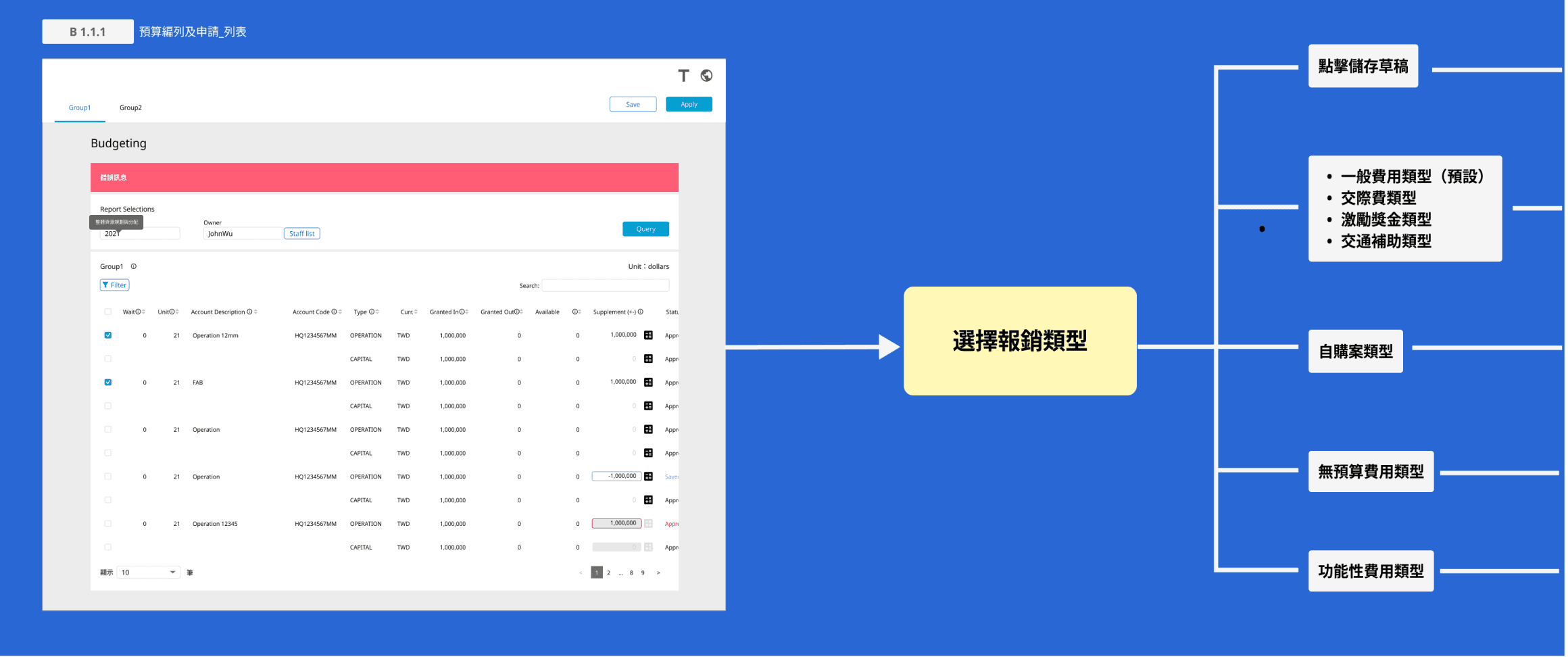
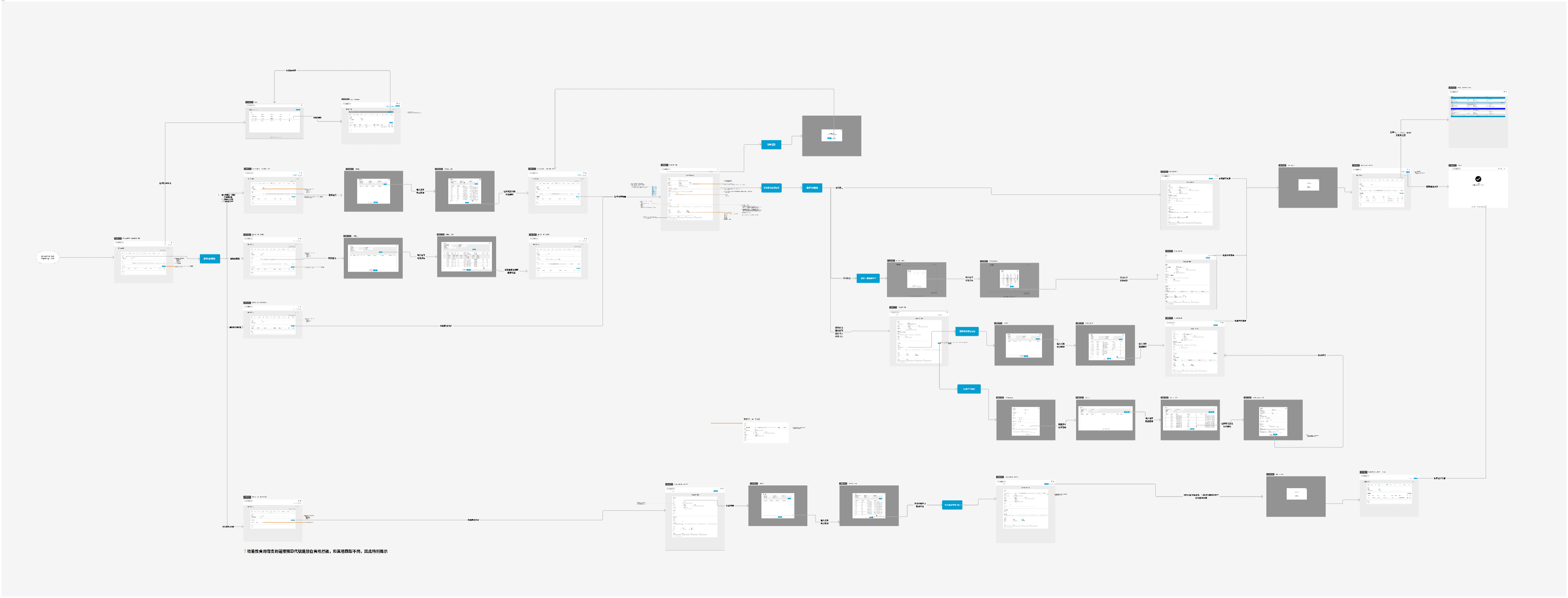
While the Budgeting system, established in 2016 and yet to be redesigned, posed challenges due to the project team's limited understanding of current business flows, complex information architecture, and lack of a clear future roadmap. In response, I designed visual user flows to facilitate meaningful conversations with stakeholders, ensuring that the redesign aligned with company policies.
Wireframes and Prototypes
Wireframes
Given that senior executives are the primary users of the budgeting system and its critical importance, it's essential to collect various scenarios for thorough design and testing.
17 screens
8 prototypes
4 rounds of tests
15 participants

Prototypes
Goal
We aim to improve the budgeting system by integrating an intuitive design and aligning user interactions with other internal platforms, enabling senior executives to effectively manage departmental resources and provide accurate forecasts for future spending.
Features
Architecture Design: Similar to internal ERP systems, it features layout with three main sections: header, navigation bar (for switching functions on the upper left and page-wide buttons on the upper right), and body.
Information Icon (i): The design helps users in understanding the terminologies.
Filter and Search: This allows executives to quickly access and view the budget details for specific department.
Fixed Actions: The design incorporates editing options at the end of each table row, enabling users to intuitively select and perform actions directly on the chosen row.
Copy: Allows managers to replicate last year's budget details or same-item entries from different vendors this year, significantly reduce data entry time.
Approval Consolidation: This feature enables executives to view and approve related budget requests on a single page, minimizing allocation risks, and enhancing precision in annual departmental budget management.
Interaction Prototype



Testing
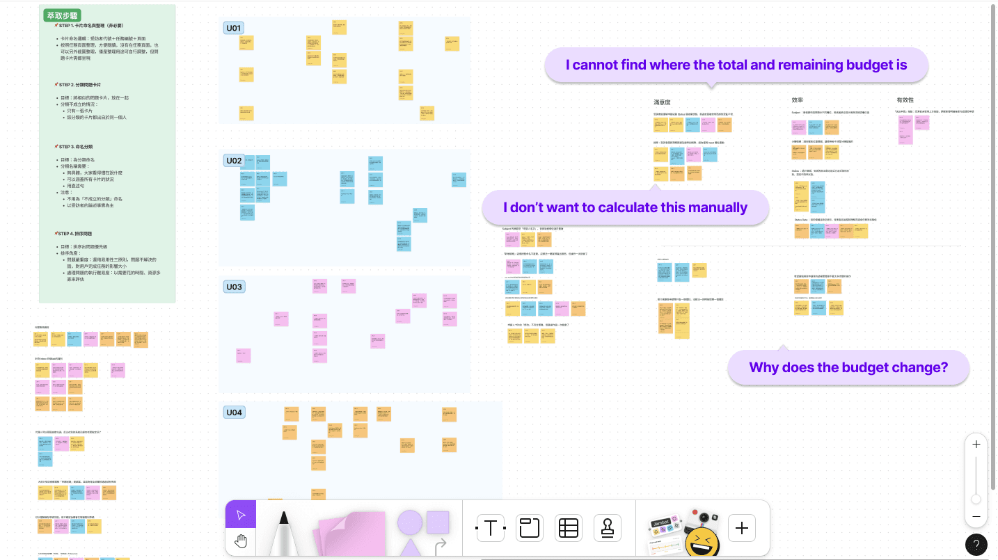
In the budgeting system's usability testing, we interviewed four key users with the prototype, encouraging them to think aloud. This helped us capture their immediate reactions and experiences with the system, which we then categorized based on efficiency, effectiveness, and satisfaction. From this, we pinpointed the top three priority insights as follows.
Learning 1
Managers and budget owners were frustrated by the need to manually calculate and input an item's budget for each execution months.
Learning 2
Approving executives found it challenging to find or understand where and how to view the remaining budget. This difficulty hinders them from making precise annual budget forecasts for the company or department.
Learning 3
Approving executives faced difficulties in the decision-making process due to insufficient insights into the reasons behind budget modifications and limited access to historical data.
Finalize



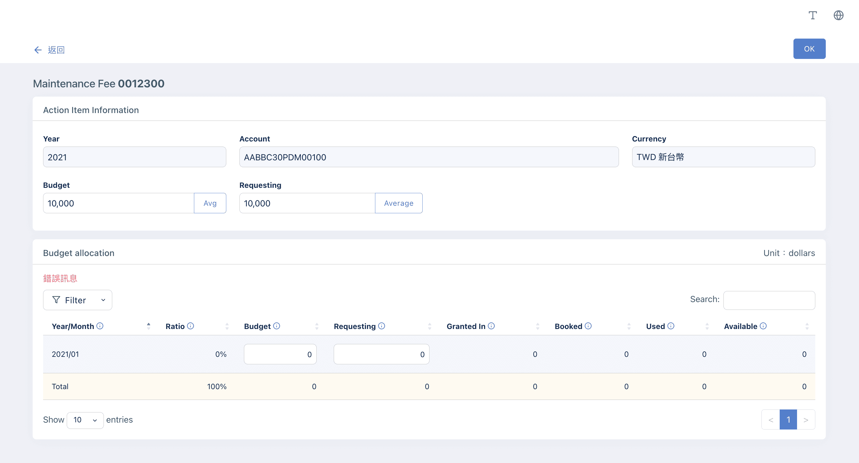
Key Screen 1
Budget Planning page allows users to edit selected items on a single sub-page, improving information clarity during application.
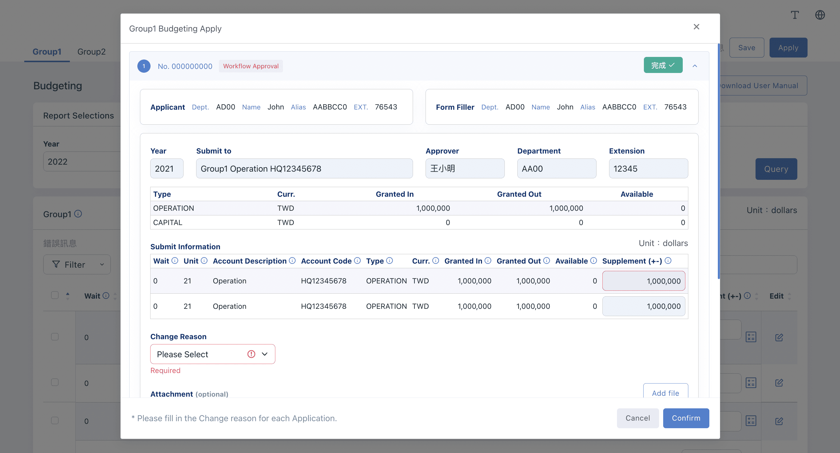
Key Screen 2
Budget Applying page allows users to review and confirm the planned budgets, ensuring accuracy before submission.
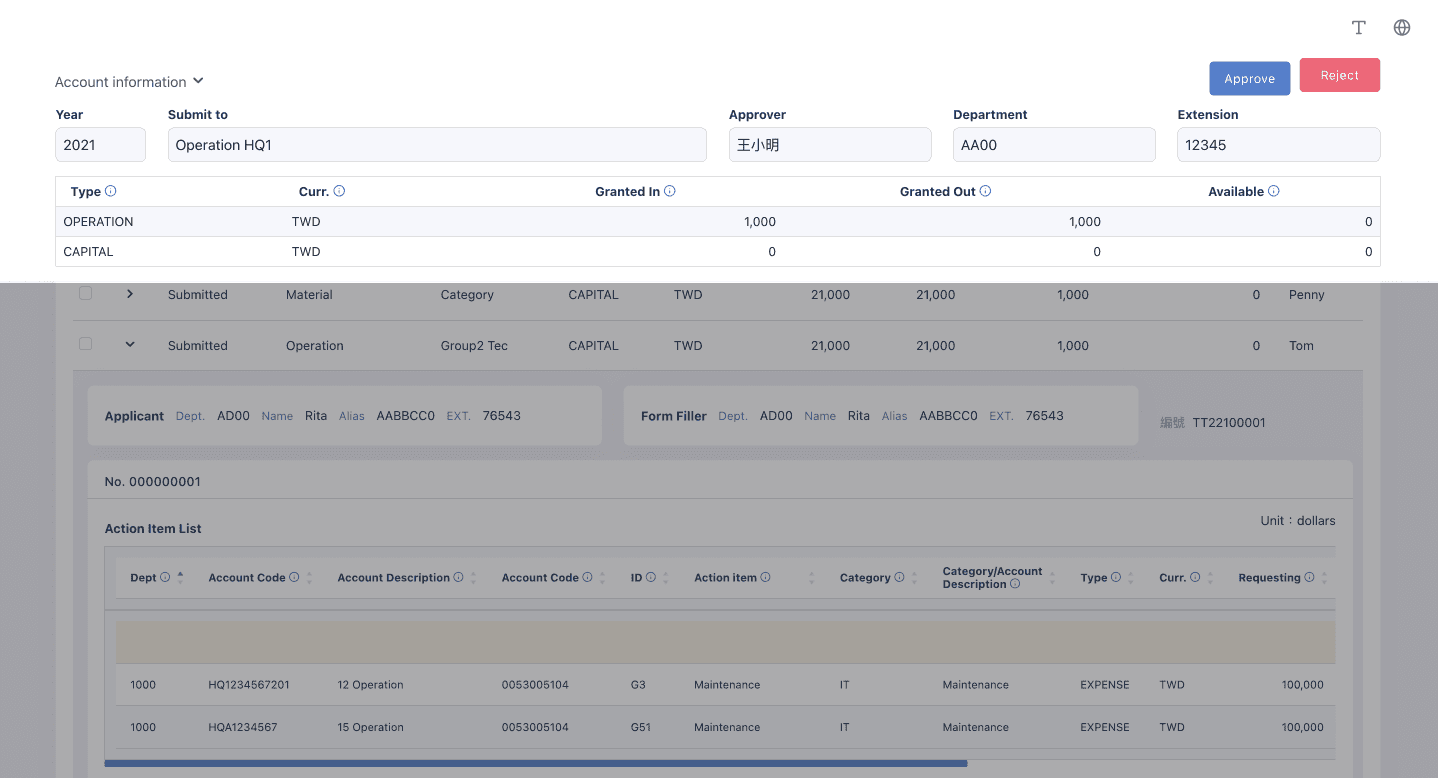
Key Screen 3
Approval page offers executives a comprehensive view of the real-time remaining budget, facilitating batch budgeting decisions.
Result
80 %
Reduction in workload
50 %
Reduction in budgeting time
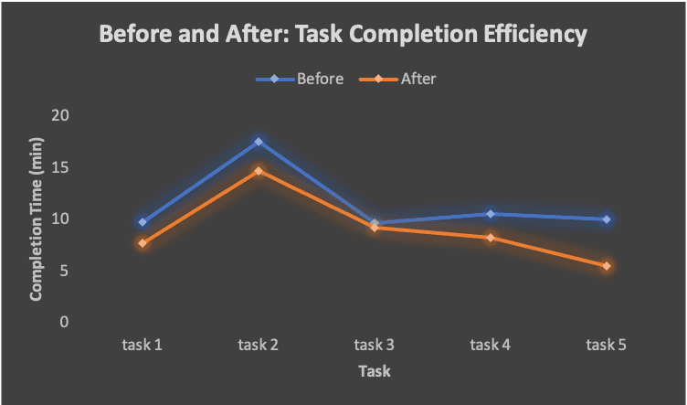
The project's success due to its coherent information architecture and intuitive design. Key features like informative feedback and error-proofing significantly improved complex budgeting tasks. Beyond workload reduction and shorter budgeting times, the HEART framework indicated an 80% task completion rate and all of the users showed a strong preference for the revamped, clearer interface.
Room of improvement
Despite the success of the system redesign, opportunities exist to better collect real-time feedback. Due to the project's tight timeframe, we couldn't thoroughly examine qualitative feedback from users across different countries. Improving how we gather feedback can offer critical insights for further refining this system and understanding employee behavior, which can inform improvements across other internal systems, thereby elevating user input as a key element in our design approach.
Next Project →